Layout & content
The timer screen isn’t a fixed design. Everything on it — the tournament title, the countdown, the blinds, the payout list — lives in a cell you can move, restyle, or remove. Layout & content is the editor for it, and it works directly on the timer itself: what you see while editing is the real screen, rendered with the real tournament data.
Turning edit mode on
Section titled “Turning edit mode on”Tap the display settings icon (Show…) in the top app bar, then Layout & content under Customize. The screen splits, and an editing toolbar appears.
Where the toolbar lands depends on the space available:
- Wide screens — landscape, or anything at least 800 points across — put the timer on the left and a fixed editing panel down the right side. Cell settings open inside that panel.
- Portrait phones put the timer on top and a compact bar underneath with Cut, Copy, Delete, and an Edit settings button that opens the settings as a sheet.
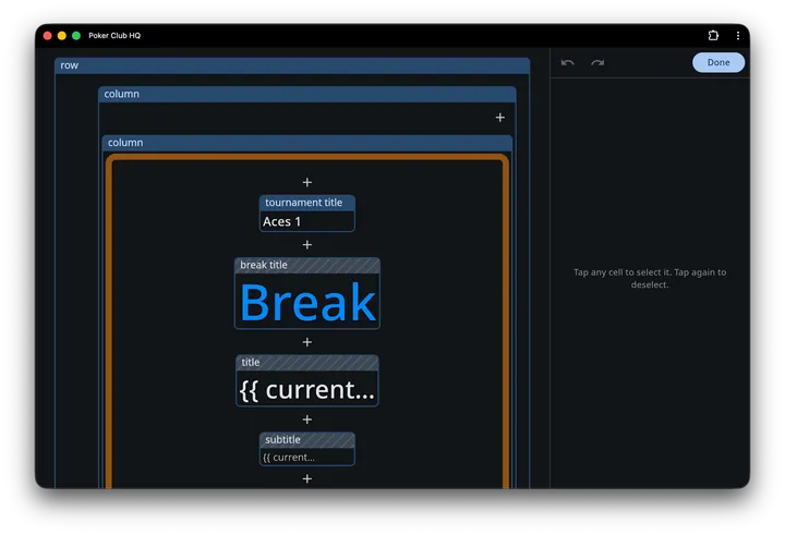
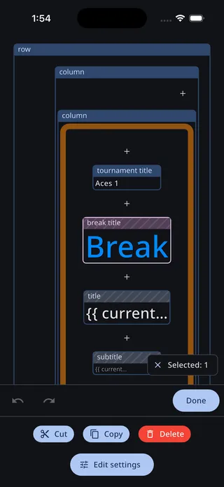
Both layouts share the same toolbar buttons:
- Undo and Redo step through your changes. History holds the last 50 edits, and rapid tweaks to the same setting — dragging a font-size slider, say — collapse into one step so undo doesn’t crawl back through every intermediate value.
- Save keeps your changes, Cancel throws them away. Cancel is red, because it discards everything since you entered edit mode.
- If you haven’t changed anything yet, a single Done button appears instead of Save and Cancel.
Reading the editor
Section titled “Reading the editor”In edit mode every cell is outlined and labelled, including cells that the live timer would be hiding right now:
- Text cells are labelled with the name of the content they display —
clock,blinds,player count. - Rows and columns are labelled
roworcolumn, followed by their condition when they have one, e.g.column: {{ totalCollected > 0 }}. - Hidden cells — ones whose condition is currently false, or whose content produces no text — keep their place in the layout but get a diagonally striped label bar. They’re still fully editable; the stripes just tell you the live timer wouldn’t be drawing them at this moment.
- A text cell whose content evaluates to nothing shows a short preview of its raw text instead of blank space, so the cell stays findable. If the content name doesn’t resolve at all, the cell reads
Missing variable "…".
Live preview
Section titled “Live preview”The editing view is deliberately annotated — cells outlined, labelled, and striped so you can find and grab them. To see the screen the way viewers actually see it, the wide-screen editing panel carries a live preview at the bottom: a clean, read-only render of the timer with no outlines, no labels, and hidden cells genuinely hidden. It’s shaped to match your window, so it reads as a true miniature of the real thing.
It updates as you edit. Restyle the text, swap a background, drop in a widget — the preview picks up your draft immediately, rendered against the real tournament with chips and tables in place, exactly as it’ll look once you Save.
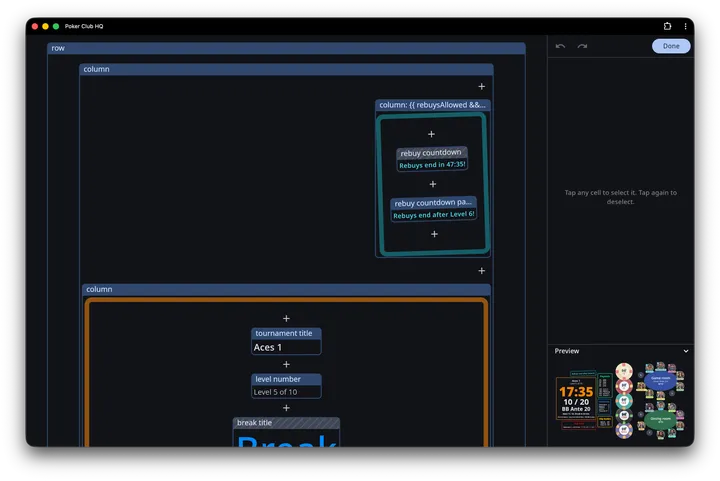
Tap the Preview header to collapse it and hand that height back to the editing controls above; tap again to bring it back. The app remembers which way you left it between sessions.
The preview belongs to the wide-screen layout only — portrait phones, where the controls already fill a compact bar, have no room for it. It also tucks itself away on any window too short to show both the controls and a usefully sized preview.
Selecting cells
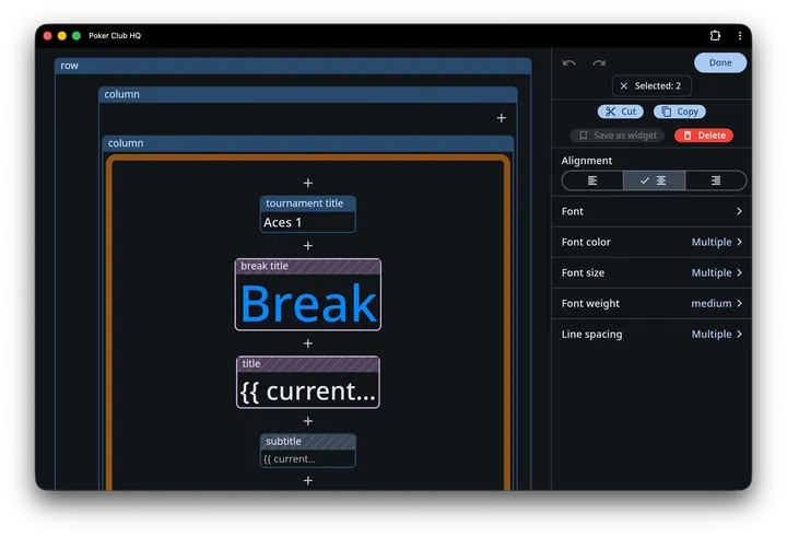
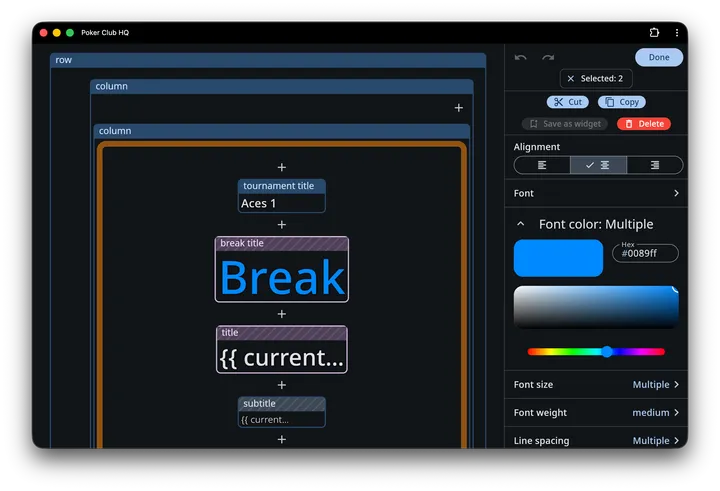
Section titled “Selecting cells”Tap a cell to select it, and tap it again to deselect. Selection is additive — tapping a second cell adds it to the selection rather than replacing it, which is how you restyle several cells at once.
A Selected: 2 chip shows how many cells are in play; tap the chip to clear the selection entirely. On wide screens the chip sits in the editing panel; on phones it floats over the timer.
When more than one cell is selected:
- Settings that differ across the selection show Multiple instead of a value. Changing one writes it to every selected cell; leaving it alone leaves each cell’s own value intact.
- Content and Condition drop out of the settings list — those are inherently per-cell.
Acting on a selection
Section titled “Acting on a selection”With at least one cell selected, these commands are available:
| Command | What it does |
|---|---|
| Cut | Removes the cell and puts it on the clipboard |
| Copy | Puts a copy of the cell on the clipboard |
| Save as widget | Adds the cell to your widget gallery for reuse — one cell at a time |
| Delete | Removes the cell |
Cut and Delete are unavailable for the outermost cell, since something has to hold the layout. If you select a container and something inside it, the command applies to the container only — the child comes along with it.
On a portrait phone, Save as widget isn’t on the inline bar; it’s inside the sheet that Edit settings opens.
Adding content
Section titled “Adding content”+ buttons appear at every insertion point inside every row and column — before the first child, between children, and after the last. Tapping one opens an Add menu:
- Paste from clipboard — only listed when you’ve cut or copied something, and always first. Pasting empties the clipboard, so a cut cell lands exactly once.
- Content — insert a text cell and pick which content item it shows.
- Column — insert an empty column (children stacked vertically).
- Row — insert an empty row (children side by side).
- Widget — open the widget gallery and drop in a complete, pre-built block.
After the new cell lands, the timer scrolls to bring it into view.
Cell settings
Section titled “Cell settings”On wide screens, tapping a setting expands its controls inline, right below the row; a chevron collapses it again. On phones, Edit settings opens the same list as a sheet. Either way the settings are listed alphabetically.
Text cells
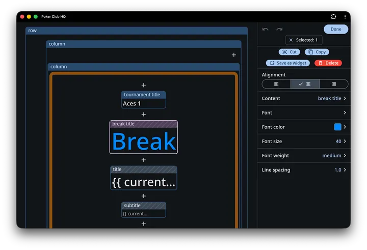
Section titled “Text cells”A text cell shows one piece of content, and everything else about it is typography:
| Setting | Notes |
|---|---|
| Content | Which content item the cell displays |
| Font | Any of the bundled Google Fonts, with a search box |
| Font size | 2–100. This is a relative size — the timer scales the whole layout to fit the screen, so think of it as proportion, not points |
| Font weight | Light through black |
| Line spacing | 1.0–2.0, for content that spans several lines like a payout list |
| Alignment | Left, center, or right |
| Font color | With a reset button to fall back to the screen’s text color |
Rows and columns
Section titled “Rows and columns”Rows and columns arrange their children and carry all the decoration:
| Setting | Notes |
|---|---|
| Alignment | How children line up. A row exposes this as Alignment, vertical |
| Condition | An expression deciding whether the whole cell — and everything inside it — appears. See Scripting |
| Spacing | 0–100, the gap between children |
| Padding | 0–100, inside the cell’s border |
| Margin | 0–100, outside it |
| Minimum width | 0–2000. The cell is never narrower than this, however little it contains. 0 means no minimum |
| Minimum height | 0–2000, the same for height |
| Background color | |
| Image | A picture for this cell |
| Image fit | How that picture fills the cell. Only appears once the cell has an image |
| Border width | 0–20 |
| Border color | |
| Corner radius | 0–100 |
| Rotation | −180° to 180° |
Padding, margin, border width and the two minimums all share one scale, so they add up the way you’d expect: a cell with a minimum width of 300 and padding of 20 leaves 260 for its contents. Note that text is measured on a different scale — a font size of 20 is roughly 80 of these units tall — so minimums are usually larger numbers than the font sizes beside them.
Reserving space
Section titled “Reserving space”A cell normally shrinks to fit its contents, which means it changes size as those contents do — a payout list grows as places are paid, a conditional label appears and shoves its neighbours along. Giving the cell a Minimum width or Minimum height holds its footprint steady, so the rest of the layout stops shifting underneath it.
The cell still grows past the minimum if its contents need the room; the minimum is a floor, not a fixed size. When contents are smaller than the floor, the leftover space is distributed according to the cell’s Alignment.
Images
Section titled “Images”The Image setting offers Manage cloud images to reuse pictures you’ve already uploaded, and Upload image to add a new one. Uploading your own images requires a subscription; without one the upload action shows a lock.
An image behaves one of two ways, depending on what else is in the cell:
- Behind other cells. If the row or column has children, the image sits behind them as a backdrop, and the children decide how big the cell is.
- On its own. If the cell has no children, the image is the content — this is how you place a club logo or a sponsor badge.
A cell showing only an image needs a Minimum width or Minimum height, because a picture on its own has no size to give the cell. Set just one of the two and the other follows the image’s shape, so a logo keeps its proportions: give it a minimum width of 400 and the height works itself out.
Whenever the cell’s shape is decided by something other than the picture — both minimums set, or a backdrop sized by the cells in front of it — Image fit settles the mismatch:
| Fit | What it does |
|---|---|
| Cover | Fills the whole cell, cropping whatever overflows. Best for backdrops |
| Contain | Fits the picture entirely inside the cell, leaving space on two sides if the shapes differ. Best for logos |
| Fill | Stretches the picture to the cell exactly, distorting it if the shapes differ |
Conditions
Section titled “Conditions”A row or column with a Condition only appears when that condition is true, which is how a payout block stays out of the way until money has been collected. Leave it empty and the cell always shows.
The condition editor has syntax highlighting and completion, shows what the expression currently evaluates to, and rejects anything that isn’t true or false. The { } button in its app bar opens the Script explorer, which lists every value you can reference along with its current value.
See Scripting for the language, and Tournament data for the full list of values.
Saving: one level, or all of them
Section titled “Saving: one level, or all of them”Timer customizations can differ per level — a calm background during breaks, something louder during blind levels. So when you tap Save, the app asks how far the change should reach with an Update: menu:
- this level — only the level you’re looking at
- all blind levels, all break levels, or all pregame levels — every level of that type
- all levels — the whole tournament
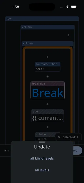
Cancelling the Update menu doesn’t lose your work — you stay in edit mode with the draft intact.
Starting over
Section titled “Starting over”Both live in the Show… menu, and both are covered on the Timer display page:
- Reset to defaults lists exactly what you’ve customized so you can reset the layout alone, or everything.
- Import customizations copies another tournament’s look onto this one, which beats rebuilding a layout you already like.